material-icon-lib
介绍:
包含1000多个material矢量图标的安卓图标库。 特性:Android Studio 设计模式中可以实时预览与代码提示。 目前包括1170个图标,你可以在这里查看这些图标: https://materialdesignicons.com。 配置分分钟就可以完成。 大小为200kb(平均每个图标170比特)。
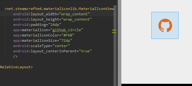
运行效果:
使用说明:
Gradle
dependencies {
    compile 'net.steamcrafted:materialiconlib:1.0.3'
}
步骤2
现在你可以使用MaterialIconView或者ImageView,使用MaterialDrawable作为Drawable资源。先来看看提供的view。
在xml中添加view:
<net.steamcrafted.materialiconlib.MaterialIconView
    xmlns:app="http://schemas.android.com/apk/res-auto" <!-- VERY IMPORTANT -->
    android:layout_width="48dp"
    android:layout_height="48dp"
    app:materialIcon="clipboard_arrow_down" <!-- This sets the icon, HAS AUTOCOMPLETE ;) -->
    app:materialIconColor="#fff" <!-- Sets the icon color -->
    app:materialIconSize="24dp"  <!-- Sets the icon size -->
    android:scaleType="center" <!-- Centers the icon (all scale types supported) -->
    android:background="@android:color/darker_gray"
    android:id="@+id/icon"
/>
你也可以使用"wrap_content":
<net.steamcrafted.materialiconlib.MaterialIconView
    xmlns:app="http://schemas.android.com/apk/res-auto" <!-- VERY IMPORTANT -->
    android:layout_width="wrap_content"
    android:layout_height="wrap_content"
    android:padding="12dp" <!-- now we use a padding to center the icon -->
    app:materialIcon="clipboard_arrow_down" <!-- This sets the icon, HAS AUTOCOMPLETE ;) -->
    app:materialIconColor="#fff" <!-- Sets the icon color -->
    app:materialIconSize="24dp"  <!-- Sets the icon size -->
    <!-- scaleType is no longer required for this method -->
    android:background="@android:color/darker_gray"
    android:id="@+id/icon"
/>
这个view继承自ImageView。这意味着你可以使用ImageView的所有特性,但是注意这个view并不会缓存它创建的任意drawable,因此每次对icon有所修改的时候,都会重新生成drawable。在listview中使用这个view是相当让人沮丧的,如果你想在listview中使用这些icon的话,缓存drawable并结合使用MaterialDrawableBuilder和ImageView!
就如之前提到的这个类继承自ImageView类,但有一些特有的方法:
// Sets the icon, all 1000+ icons are available inside the MaterialDrawableBuilder.IconValue enum
yourMaterialIconView.setIcon(IconValue iconValue);
// Sets the size of the icon to the default action bar icon size
yourMaterialIconView.setToActionbarSize();
// Provide a dimension resource to use as icon size
yourMaterialIconView.setSizeResource(int dimenRes);
// Set the icon size using a value in dp units
yourMaterialIconView.setSizeDp(int size);
// Set the icon size using a pixel value
yourMaterialIconView.setSizePx(int size);
// Set the icon color
yourMaterialIconView.setColor(int color);
// Set the icon color using a color resource
yourMaterialIconView.setColorResource(int colorRes);
// Set the icon's alpha value (0-255) 0 for completely transparent
yourMaterialIconView.setAlpha(int alpha);
// Sets a custom colorfilter to the drawing paint (for the more advanced devs)
yourMaterialIconView.setColorFilter(ColorFilter cf);
// Clear the color filter set using above method
yourMaterialIconView.clearColorFilter();
// Sets a custom paint style (for the more advanced devs)
yourMaterialIconView.setStyle(Paint.Style style);
// You can use any of the ImageView methods as well:
yourMaterialIconView.setBackgroundColor(Color.WHITE)
yourMaterialIconView.setScaleType(ScaleType.CENTER)
// etc...
That was easy, right? Next up the custom drawables, they are internally used by theMaterialIconView so you'll see that they share many of the same methods.
The initialisation happens using the MaterialDrawableBuilder, which you can use to set all the properties of the drawable:
// The method returns a MaterialDrawable, but as it is private to the builder you'll have to store it as a regular Drawable ;)
Drawable yourDrawable = MaterialDrawableBuilder.with(context) // provide a context
        .setIcon(MaterialDrawableBuilder.IconValue.WEATHER_RAINY) // provide an icon
        .setColor(Color.WHITE) // set the icon color
        .setToActionbarSize() // set the icon size
    .build(); // Finally call build
This will throw an IconNotSetException if you forget to provide an icon.
Once you call build, your Drawable will be spit out and you are ready to use it everywhere you please! Setting it to a view is just as easy as with any other Drawable (e.g. for ImageView):
yourImageView.setImageDrawable(yourDrawable);
And that's all there is to it. Below are all the methods you can use with theMaterialDrawableBuilder for reference.
// Sets the icon, all 1000+ icons are available inside the MaterialDrawableBuilder.IconValue enum
builder.setIcon(IconValue iconValue);
// Builds the drawable, this method always comes last ofcourse
builder.build();
// Sets the size of the icon to the default action bar icon size
builder.setToActionbarSize();
// Provide a dimension resource to use as icon size
builder.setSizeResource(int dimenRes);
// Set the icon size using a value in dp units
builder.setSizeDp(int size);
// Set the icon size using a pixel value
builder.setSizePx(int size);
// Set the icon color
builder.setColor(int color);
// Set the icon color using a color resource
builder.setColorResource(int colorRes);
// Set the icon's alpha value (0-255) 0 for completely transparent
builder.setAlpha(int alpha);
// Sets a custom colorfilter to the drawing paint (for the more advanced devs)
builder.setColorFilter(ColorFilter cf);
// Clear the color filter set using above method
builder.clearColorFilter();
// Returns the alpha value
builder.getOpacity();
// Sets a custom paint style (for the more advanced devs)
builder.setStyle(Paint.Style style);
已下载
0